
COULD THE INDIAN GOVERNMENT’S MOVE ACTUALLY INCREASE, AND NOT DECREASE, BLACK MONEY?
I was shocked by the Indian government’s unexpected decision to withdraw Rs. 500 and Rs. 1,000 notes. There were several things that I found wrong with the policy. The extreme hardship that the common man would be put to; the illegality of withdrawing currencies that were “legal tender”, backed by the full authority of the sovereign republic of India; the autocratic manner in which the decision was made, without prior consultation or communication; the poor planning and coordination involved in such a massive exercise; and so on.
But what intrigued me was something else. How did the Indian government decide what the largest currency note should be, and therefore which notes were to be withdrawn? How did the government decide that Rs. 500 and Rs. 1,000 notes were “too big” for routine transactions, and therefore should be scrapped? How did they know that Rs. 50 and Rs. 100 notes are not “too big”, and should be retained? Could it be that Rs. 10,000 and Rs. 50,000 notes are actually good for the economy, and it is the Rs. 100,000 notes that are “too big” (and therefore should be scrapped)?
So the key question in my mind was this. How big should the country’s largest currency note be? How do we know what currencies are “too big” (and should be withdrawn), and what currencies are not (and should be retained)? Is there some logic behind this decision?
I looked at the US currency notes in my wallet. Americans commonly use $20 notes, but the largest currency note is $100, which is rarely used. How did the US government decide that $100 should be the largest currency note? How did they decide that $1,000 and $10,000 notes are “too big” (and should not be printed), but $50 and $100 are not “too big” (and should be printed)?
That set me thinking. How high should a country’s largest currency note be? Is it linked to the level of income in the country? Could it be that richer countries have higher “largest currency” levels, because their people spend relatively larger amounts of money each day or each week, and they need larger amounts of cash with them for transactions that are not conducted online or through credit cards? By the same logic, would poorer countries have lower “largest currency” levels?
I decided to do a little investigation. I looked at a sample of 20 countries from around the world, and checked Wikipedia to identify the largest currency notes in those countries. For each country, I also identified the per capita income level from Wikipedia, and divided it by 365 to get the average daily income level. I divided the largest currency note value by the average daily income per person, and compared that for the 20 countries.
Let’s take an example. The largest currency note in the US is $100, and per capita income is $56,084, which means the average American gets paid $154 per day. So the largest currency note in the US ($100) is 65% of the average daily income ($154). Let’s call this the “largest currency to average daily income” ratio.
Let’s take another example. The largest currency note in China is CNY 100, and per capita income is $8,141 per year (or CNY 55,684), so the average daily income is CNY 153 per day. The largest currency note (CNY 100) is 66% of the average daily income (CNY 153).
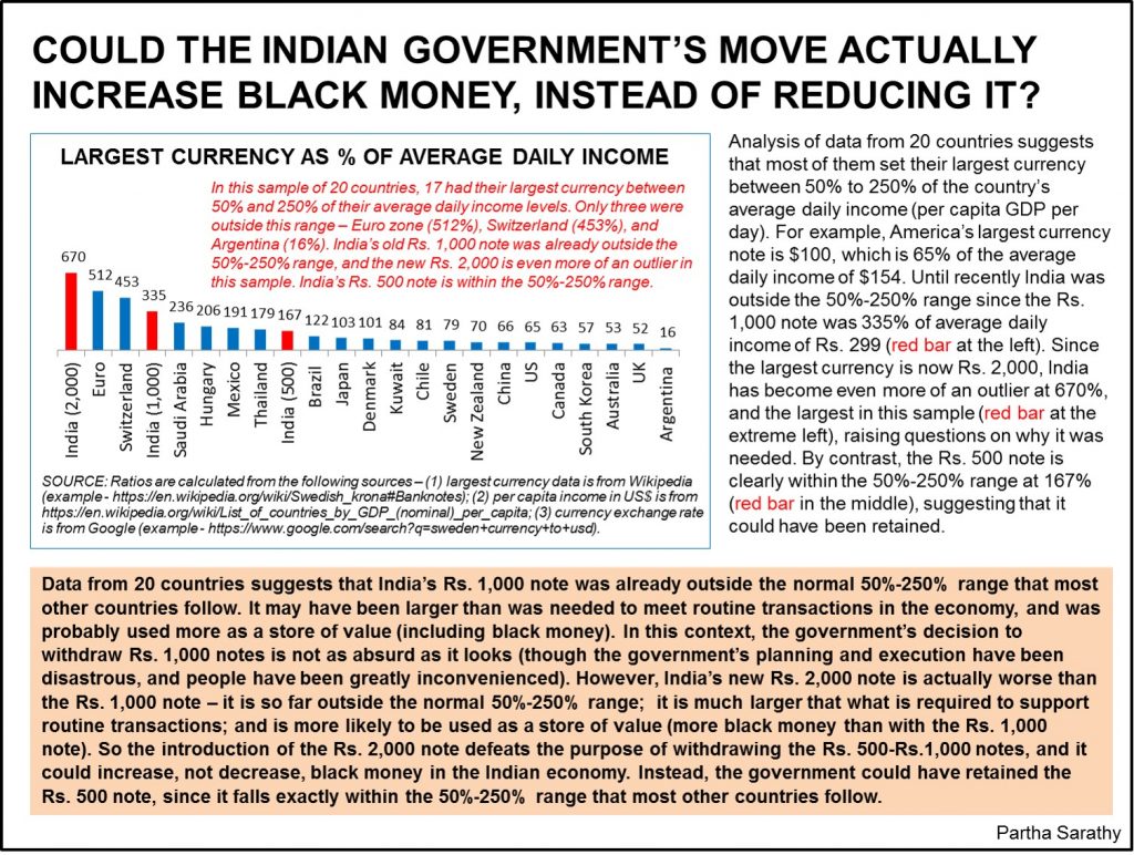
I created a chart showing the “largest currency to average daily income” ratios for 20 countries, as you can see in the image here. The ratio is 66% for US, 65% in China, 52% in UK, 122% in Brazil, and so on.
If you compare the ratios in the chart, one curious pattern emerges. The ratios of these countries are not completely random, and they seem to mostly fall within a particular range. In 17 of the 20 countries, the “largest currency to average daily income” ratio is between 50% and 250%. There are only 2 countries (out of 20) where the ratio exceeds 200% – the Euro zone is at 512%, and Switzerland is at 453%. And there is only 1 country (out of 20) where the ratio is below 50% – that is Argentina at 16%.
So 17 of these 20 countries have somehow decided, independent of each other, that their largest currency should be between 0.5 to 2.5 times their people’s average daily income. What does that mean? I am not sure, but I have a guess. If the largest currency is significantly above that range, say if it is 10 or 20 times larger than the country’s average daily income, people probably won’t need to use the largest currency for their routine transactions, and would instead use it to store their wealth (some of which could be black money). No government would like that to happen. If the largest currency is too far below this range, perhaps people need to carry large bundles of cash for routine transactions, which is also undesirable.
Let’s consider the US, where average daily income is $154 and the largest currency is $100. I need cash to pay for coffee from Starbucks drive-through (where credit cards are a hassle), dinner from Chipotle, parking fees to the garage attendant, and so on. All of these are small transactions that could be handled using $20 notes, so I rarely need to use the $100 note. But what if the largest currency in the US was $1,000, and not $100? My guess is that the $1,000 note is “too big” for routine use, and is more likely to be used to keep savings at home for emergencies, or make payments to disreputable merchants who prefer cash transactions (so that the merchants could evade tax, i.e. create black money). What if the largest currency in the US was even bigger, say $10,000 or $100,000? We could say with certainty that these currencies are “too big”, and even more likely to end up as black money (versus if the largest currency was $100).
It appears reasonable to infer that the largest currency in a country should be of the same order of magnitude (i.e., not several times larger or smaller) as its average daily income level. This is not a “rule” or axiom; it’s just an inference from our sample of 20 countries. Of course there are several limitations to this analysis, as I will explain later.
Now let’s look at Indian currency notes. Until the government’s demonetization drive, the largest currency was Rs. 1,000, which was 335% of the average daily income of Rs. 299. This ratio is higher than those of 18 countries (out of 20) in our sample that were in the 50%-250% range. (Please see the red bar on the left in the chart attached.) It is reasonable to consider that the Rs. 1,000 notes are not necessary to meet routine transactions for most people, and are more likely (compared to say Rs. 100 notes) to be used to store one’s savings, and for tax evasion and black money. So by the yardstick of the “largest currency to average daily income” ratio, it would appear that the Rs. 1,000 note is “too big” and deserves to be scrapped, just as the government has done.
But what about the Rs. 2,000 note? Its “largest currency to average daily income” ratio comes to 670% of the average daily income of Rs. 299, which is extremely high, and higher than those of the 20 countries in our sample. (Please see the red bar on the extreme left in the chart.) India’s Rs. 2,000 note is the outlier in this chart. It does not fit the pattern followed by the 20 other countries, and is an aberration. If the Rs. 1,000 note is “too big” for routine use and is likely to be used for black money, then the Rs. 2,000 note is even more likely to be used for black money.
So by the yardstick of the “largest currency to average daily income” ratio, it appears that the Rs. 2,000 note is certainly “too big” and deserves to be scrapped. Instead of reducing black money, the Rs. 2,000 note is actually likely to increase black money.
In conclusion, the Rs. 2,000 note clearly violates the government’s stated goal of removing high value notes as a way to eliminate black money. I still do not understand why the government created the new Rs. 2,000 notes when it was so keen to withdraw the Rs. 500 and Rs. 1,000 notes. I am baffled, and I have not found a satisfactory explanation anywhere.
Incidentally, there was one “explanation” from a Surat-based chartered accountant that was popular in social media, but it was silly (“This Surat CA’s open letter to Kejriwal explaining how Rs 2,000 will curb black money is going viral”, according to a news report.) This CA claimed that the Rs. 2,000 notes make it impossible for tax evaders to continuously deposit old Rs. 1,000 notes into the bank and withdraw new Rs. 1,000 notes, and pretend that the cash deposited each day was withdrawn the previous day (peak theory). This is nonsense. The government introduces new currency notes with a long-term (10-20 year) perspective to facilitate transactions in the economy. The government cannot and will not introduce a new Rs. 2,000 note just to catch tax evaders during the brief 2-week window for withdrawals after demonetization.
Note – this analysis has several limitations, so its conclusions should be treated with caution. First, the sample of 20 firms may be too small, and we should be careful about drawing inferences from such a small sample. Second, our sample may be biased in that these countries may have high penetration levels for e-banking, credit cards, and online transactions; and their examples may not be relevant for India. Third, per capita GDP may be the wrong indicator to use in this context; perhaps median income is more representative than average income. Fourth, I collected a lot of this data from Wikipedia, which is not the most authoritative data source in the universe. Fifth, the fact that the “largest currency to average daily income” ratio in this sample fell in the 50%-250% range does not mean that this range is ideal; it could be that all of these countries are on the wrong track and it’s the outliers that have got it right.
My raw data files are here, if anyone wants to check them